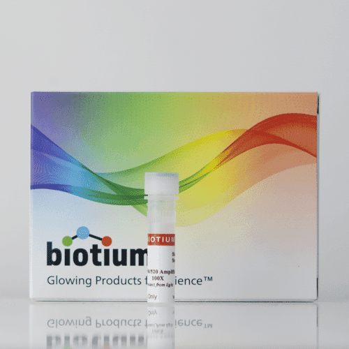
Packaging that finally looks like the fluorescence company.
Project
Biotium packaging redesign
Year
2023
A full redesign of Biotium's product packaging across three box variations, replacing the old logo and a flat, clinical brand blue with a vibrant, color-forward look built around the company's own identity: a fluorescent products maker whose tagline is literally "Glowing Products for Science."
Scope of Work

The Problem
Biotium's existing packaging carried the old logo and an outdated brand blue that read as cold and clinical, at odds with a company built entirely around fluorescence and color. The box design didn't reflect what was actually inside it.
The Approach
I redesigned the packaging across three box variations, replacing the dated blue and old logo with a vibrant, color-forward gradient that leans into Biotium's identity as a fluorescence company, matching the energy of the "Glowing Products for Science" tagline instead of working against it.
The Outcome
All three box variations were designed and printed and have been in production across the catalog for a couple of years now, replacing the old packaging system entirely.